The Deadline is Approaching
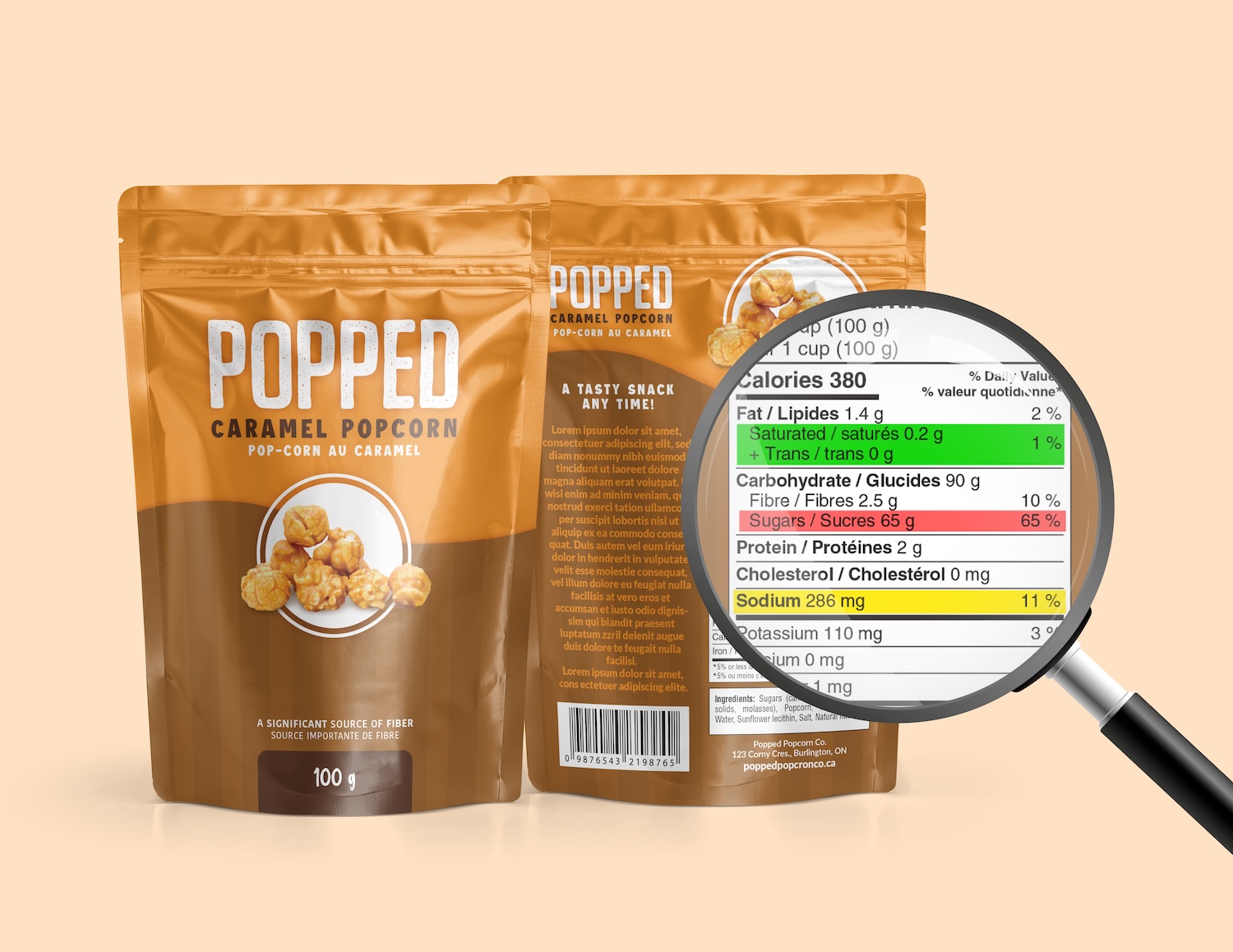
By January 2026, Health Canada’s Front-of-Package (FOP) Nutrition Symbol regulations will take effect. These new rules aim to help consumers make informed choices by clearly identifying foods high in saturated fats, sodium, and/or sugars.
While 2026 may still sound far away, packaging updates can take time – from design and proofing to printing and inventory turnover. If you haven’t started planning yet, now is the time. Don’t risk a last-minute scramble to add a symbol to your packaging – plan early, stay compliant and on-brand.
Develop a Strategy
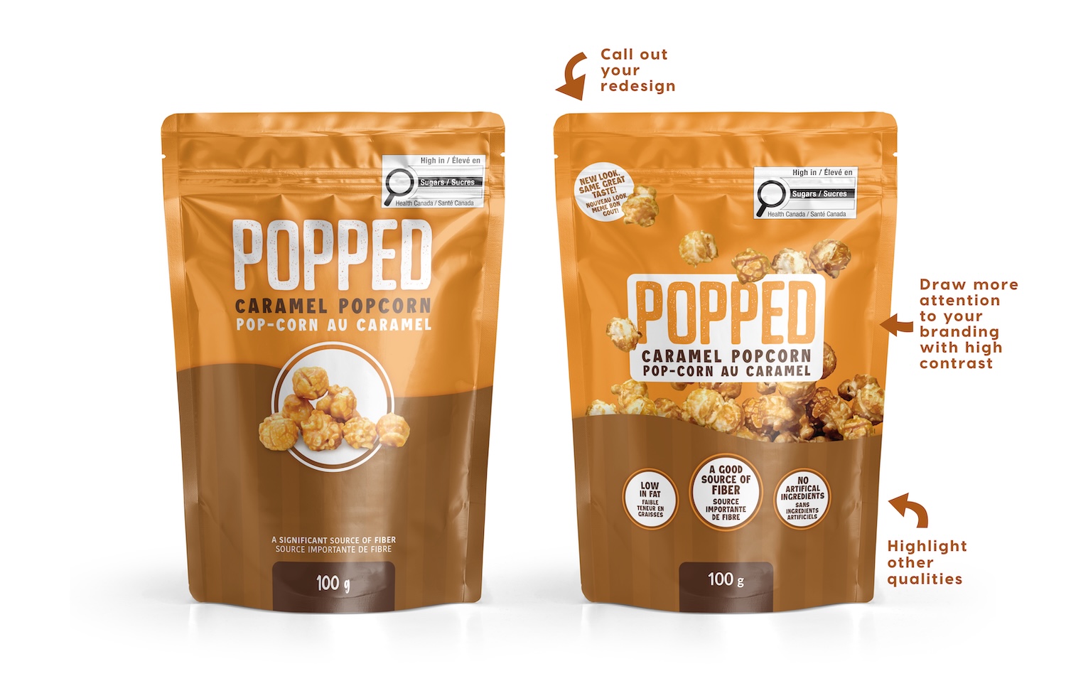
If your product requires the new FOP symbol, think of this as an opportunity to refresh and enhance your packaging design. Many markets – like snacks, sauces, and frozen meals – are going to have nearly all of their products requiring this mark and getting new packaging. Your brand has a chance to stand out with a thoughtful design.
The FOP symbol must:
- Appear in the top 50% of the Principal Display Panel (the front/main side of your packaging)
- Be sized correctly based on the surface area of that panel
- Have clear space around it, with no overlapping text or graphics
With these layout requirements, you may need to shift other design elements. That’s where smart planning and creative strategy come in.

Design Strategies to Stay Compliant and On-Brand
1. Keep the Focus on Your Brand
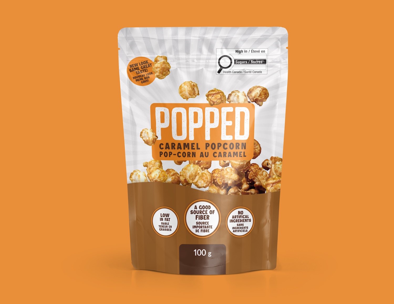
Simply adding the FOP symbol to your existing design may technically meet the rules – but it can throw off balance and hierarchy. Consider adjusting your layout, so your logo and key visuals still stand out. For example, use framing, colour contrast, or repetition of shapes to make the mark feel integrated rather than intrusive.
2. Highlight Your Product’s Strengths
Some products naturally contain higher levels of certain nutrients – and that’s okay. Focus on what makes your product great:
- “High in Fibre”
- “Low in Fat”
- “No Artificial Ingredients”
*Just be sure you can back up all claims.
3. Celebrate Your Packaging Glow-Up
A new regulatory requirement can be a great excuse for a brand refresh. Announce your new look with a callout like “New Look, Same Great Taste!” or “Fresh Design for 2026!” You don’t have to keep this forever – just long enough to grab attention and remind shoppers of your brand’s evolution.
4. Play with Contrast
Since the FOP mark is designed to stand out, you can use contrast to your advantage. Lighten or simplify the area around the symbol to subtly shift the focus back to your logo or product imagery while maintaining compliance.

Start Your Update Now
The January 2026 deadline will be here before you know it. Start planning your packaging updates today so you can roll out your refreshed, compliant look smoothly – without compromising your brand identity.
Need help visualizing how the new FOP symbol will affect your design?
✉️ Reach out to our Creative Services Team to explore strategies for staying compliant while keeping your packaging eye-catching and on-brand.