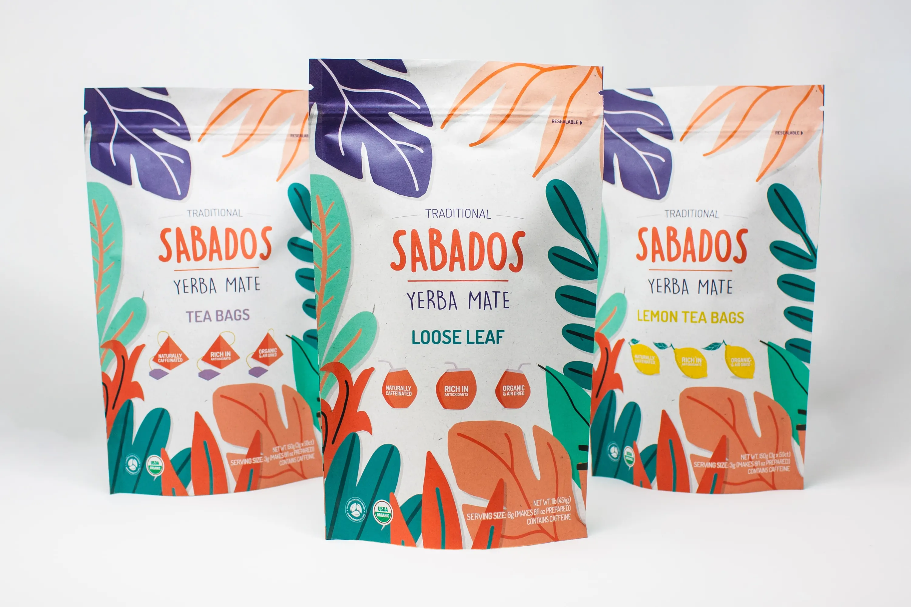
Package design, brand and web development, social media strategy, and, of course, pouch printing and manufacturing – it took a Rootree village to successfully help launch SABADOS, a new brand of organic, fair-trade yerba mate.
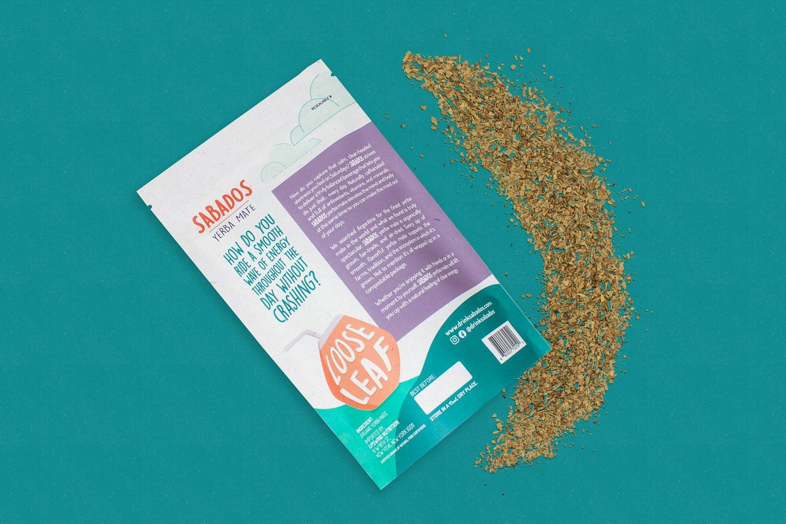
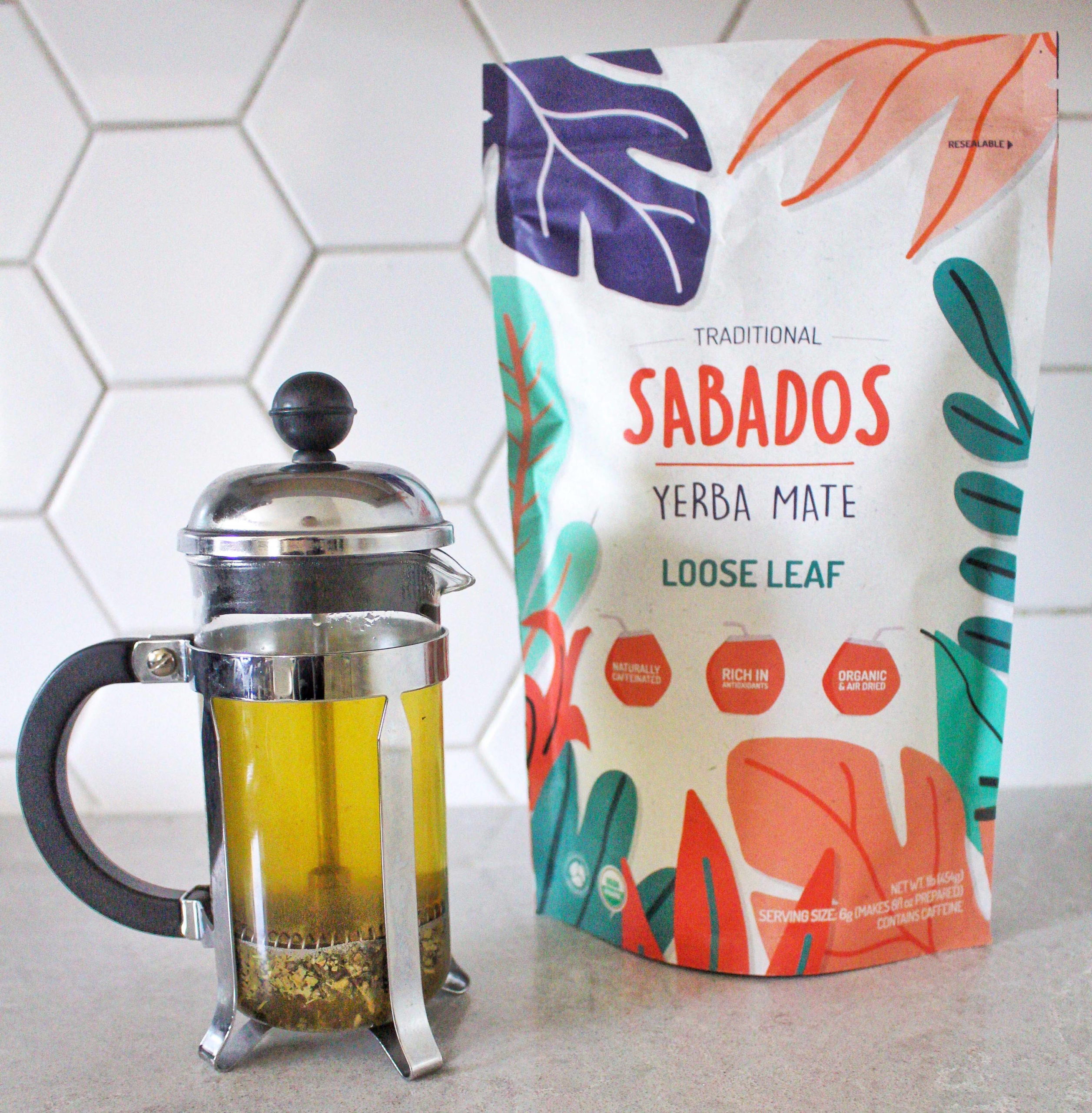
“Rootree’s ability to offer creative services and packaging is rare, and it was difficult for us to find the compostable packaging that we needed. The fact that we had an end-to-end service, from package design and production all the way to creating our website and managing our social platforms, really stood out to us. Having all of the services we needed to launch our brand done through one partner was really important to us, because it simplified and sped up the process. It made it a lot easier for us to be working with just one company.”
The Beginning
In the beginning, there was just yerba mate and Saturdays. Put them together and you get: SABADOS.
It all started on a return flight from Argentina. The founders of SABADOS, Ray Brown and John Jurbala, had both individually fallen in love with yerba mate and all its benefits. Meeting on that plane felt like fate; the creation of SABADOS brought them together to import a fair-trade, ethically sourced, and family-farmed yerba mate to the USA. They had the product, they had the vision, the only thing left was to find the perfect packaging and develop a marketing and launch plan.
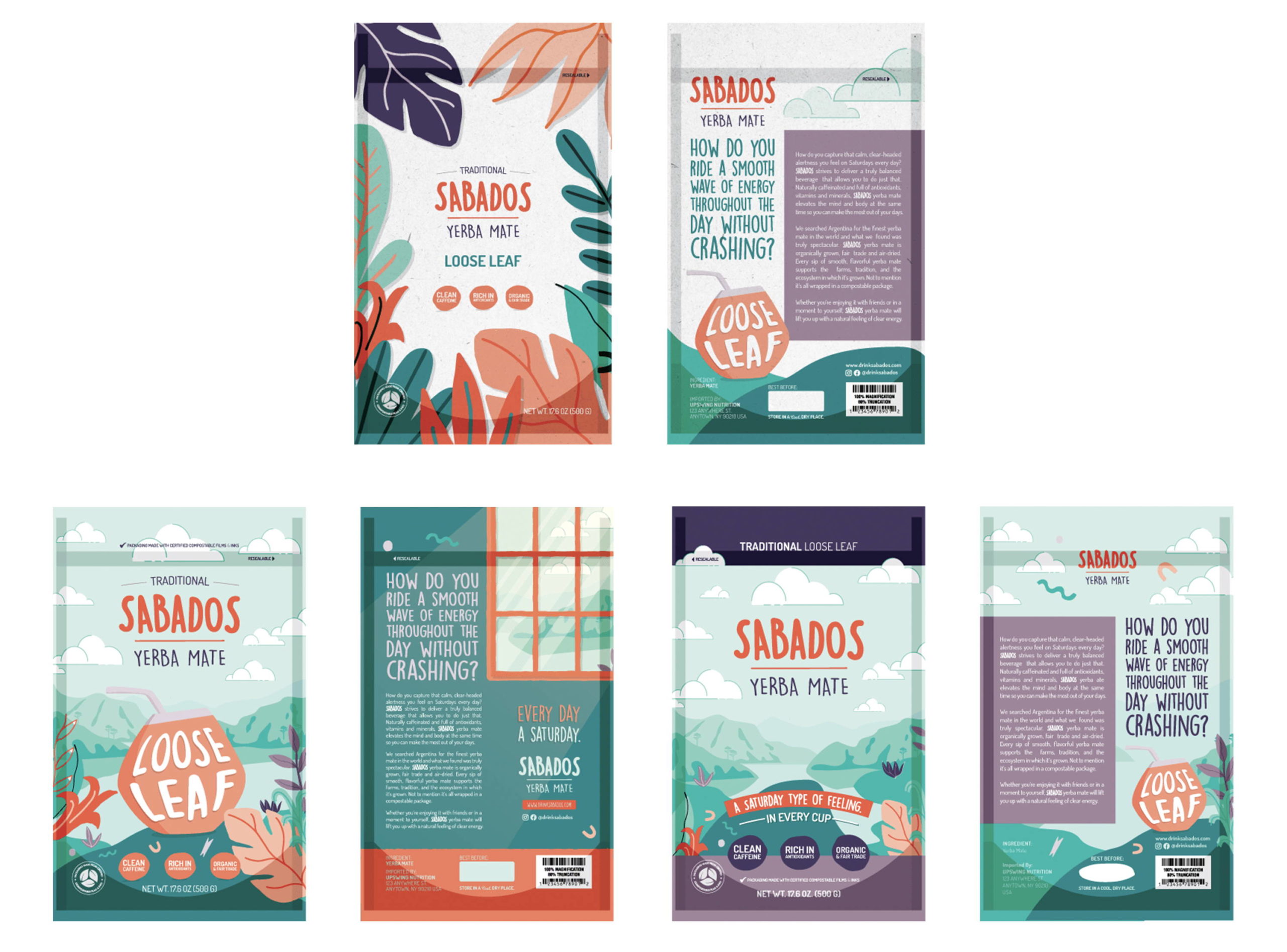
During their search for the perfect packaging, Ray and John had one specific feature in mind: they wanted sustainable packaging. As SABADOS yerba mate is organic and fair trade, it only made sense for the packaging to reflect the product. Another box they needed to check was finding an agency to help create their online presence – everything from a website to their branding needed to be determined. Insert: Rootree.
“For one, the food was really good! It was great to meet the team and have a face-to-face meeting with people experienced in their fields. A lot of amazing ideas came out of that session that we didn’t have going in, and it was awesome to tour the facility. The team asked great questions and helped us uncover things that we hadn’t communicated yet but were still important to our brand – we just didn’t know it yet. We went in with a number of ideas and came out with a more defined vision of what we wanted. It was in our brains somewhere, but only after that session were we able to articulate it properly.”
Please note: the brainstorm session took place before COVID-19.
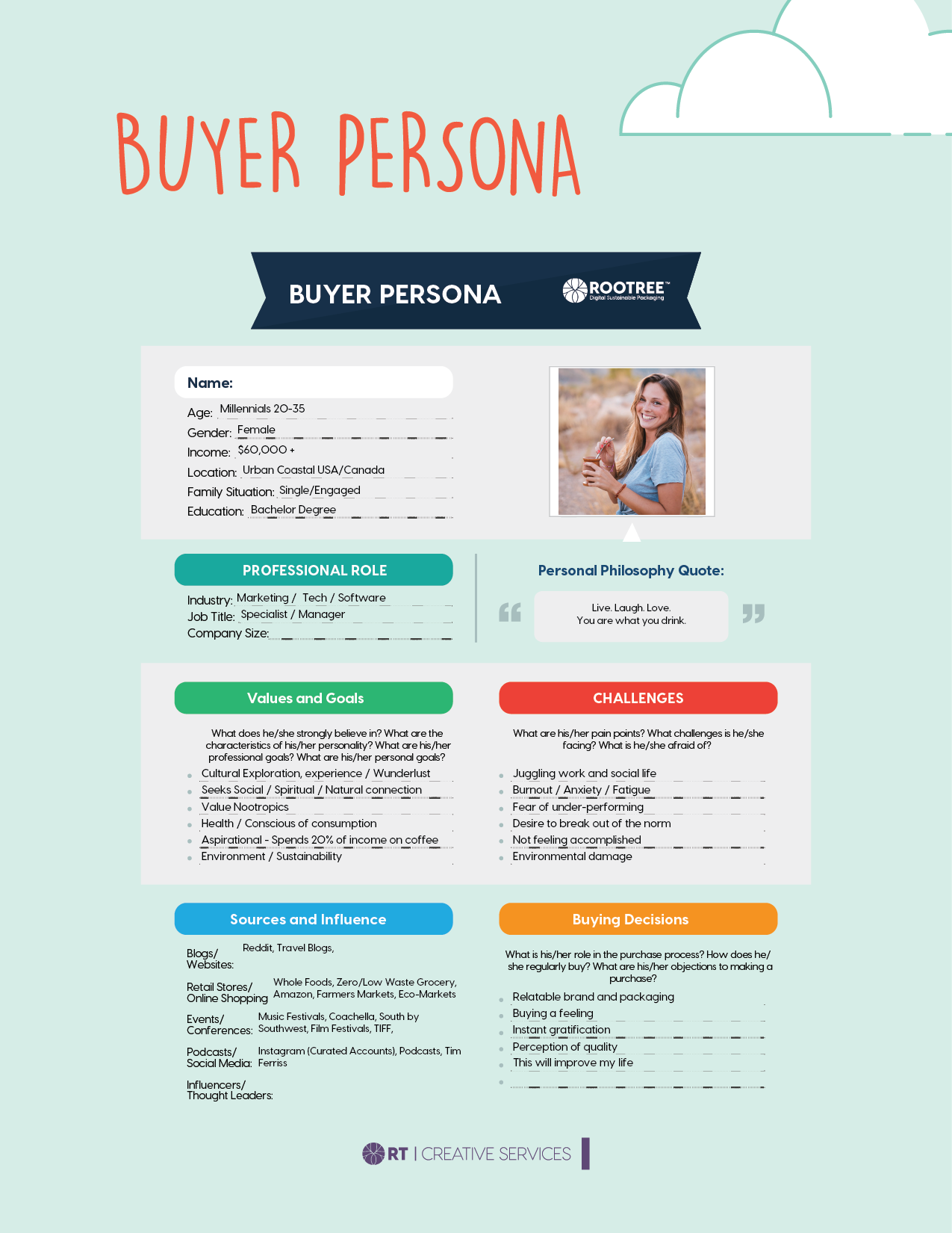
In the end, sustainable packaging and an in-house creative and marketing team were what led Ray and John to choosing Rootree. Following Rootree’s Superior Package tradition, the partnership started over a brainstorming lunch. Ray and John flew in from NYC for the session, where ideas, concepts, and a clearer vision for the brand were shared over lunch and a traditional drink of yerba mate (where all participants drink from one cup), followed by a full tour of the manufacturing facility. From the lunch, a mood board, buyer persona, brand name, and brand voice were developed.
Brand Development
With a head full of ideas flowing quicker than the waterfalls in the world of SABADOS, the next step was to put pen to paper.
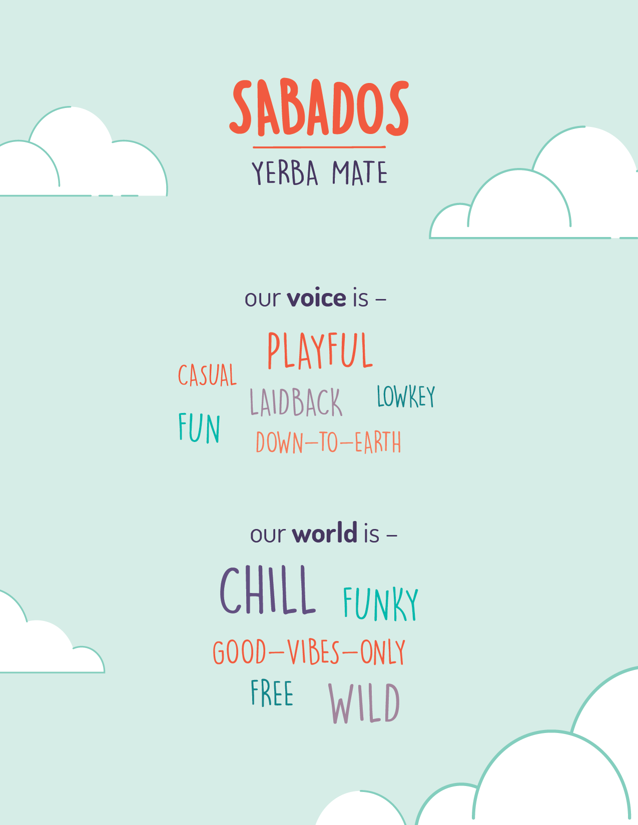
Leaving the brainstorming session with a sense of energy and excitement, our Creative team set out to develop different logos that encapsulated the SABADOS brand; down-to-earth and playful, funky and free. Soon after, their ideas were translated into a few first drafts of the SABADOS logo.
The logo concepts were sent to the Ray and John, and from there, they picked their favourite. The Rootree designers took their feedback and ran with it, quickly landing on the final product.
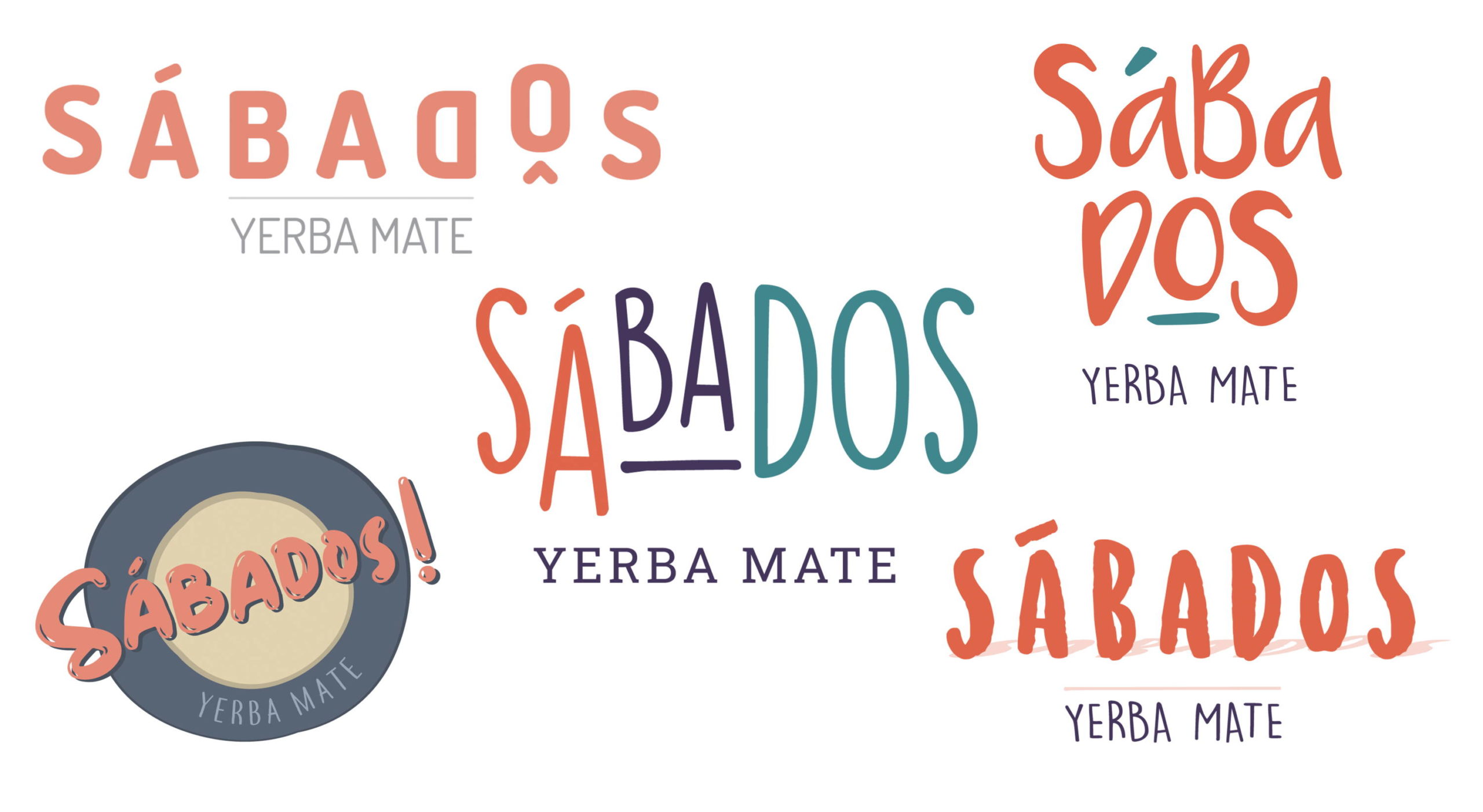
“We hadn’t launched a consumer brand before, so to be working with a team who had a depth of experience with consumer brands was essential, and a team with multiple people with different expertise was really important to us. Having those options at different stages was fundamental for us to get where we needed to be. We can’t draw, we can’t take our imagination into the real world, and [Rootree was] able to take what was in our head and put it onto paper with great intuition but also by providing us with multiple options at every step of the process.”
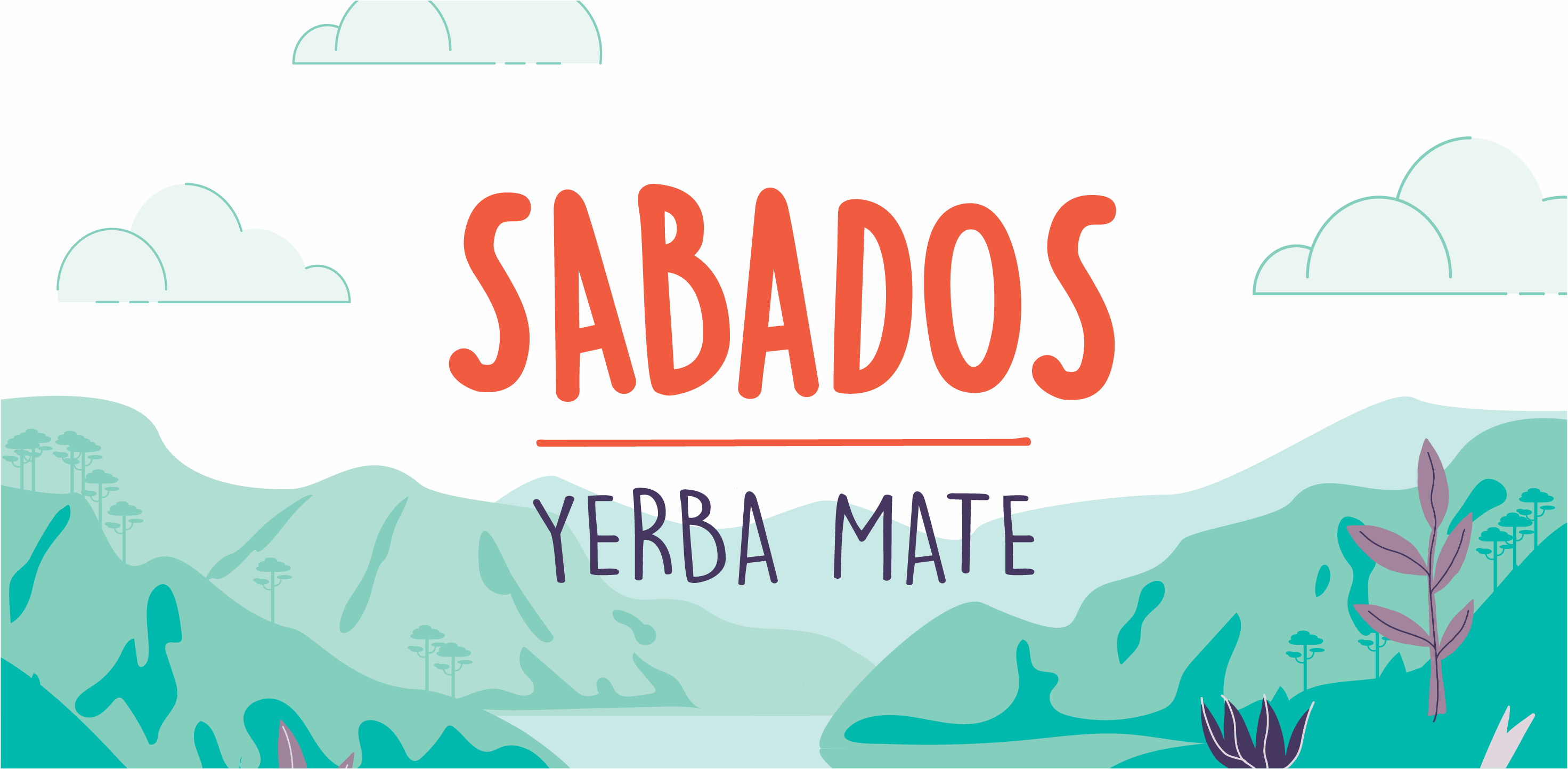
It’s easy to see how the brand continued to take shape from there. From a good-vibes-only mood to laidback and chill, the logo created a solid foundation on which the SABADOS brand continued to progress.
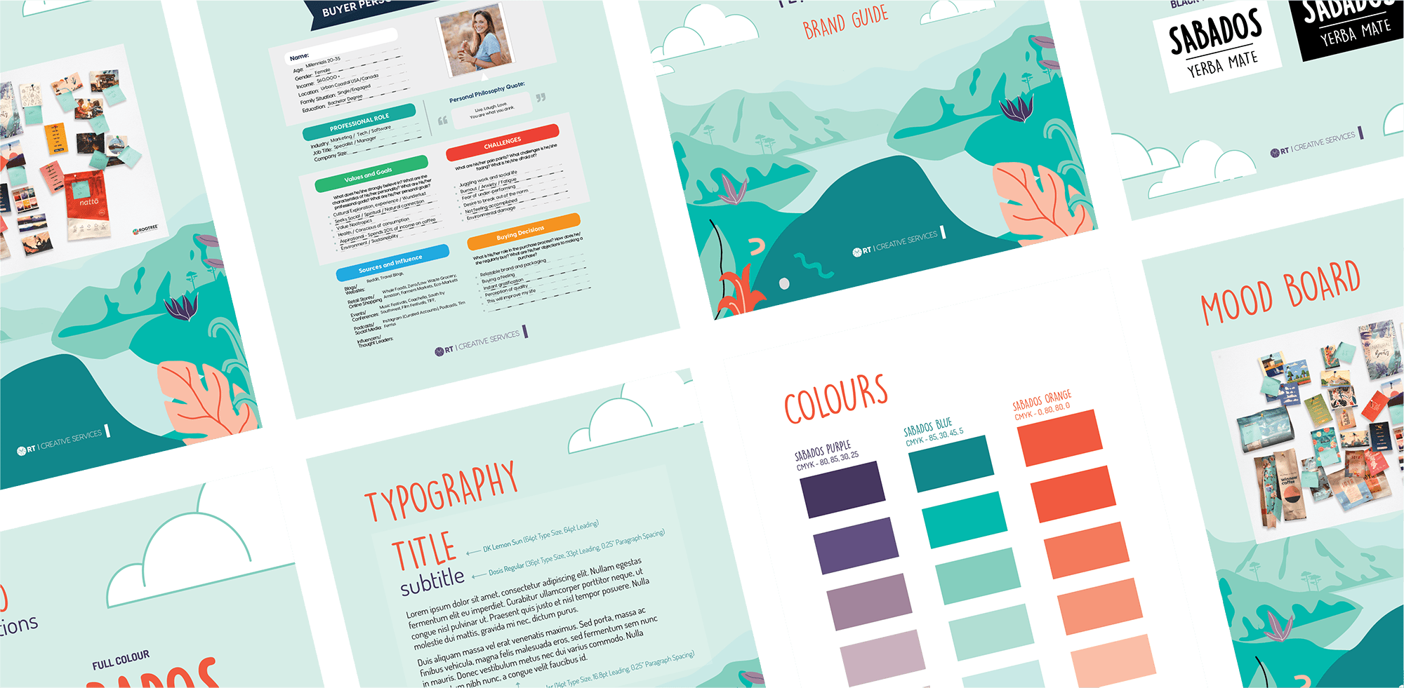
“The team was really responsive, and it was clear that they were very experienced. The combination of those two factors made me feel as though our business was in great hands. The team executed to deadlines and delivered early, and the work always exceeded our expectations. We were able to be exactly where we needed to be because we were given options at every step of the process. That was helpful because without that, we wouldn’t have ended up with a product that we were extremely proud of.”
Package Design
Web Design
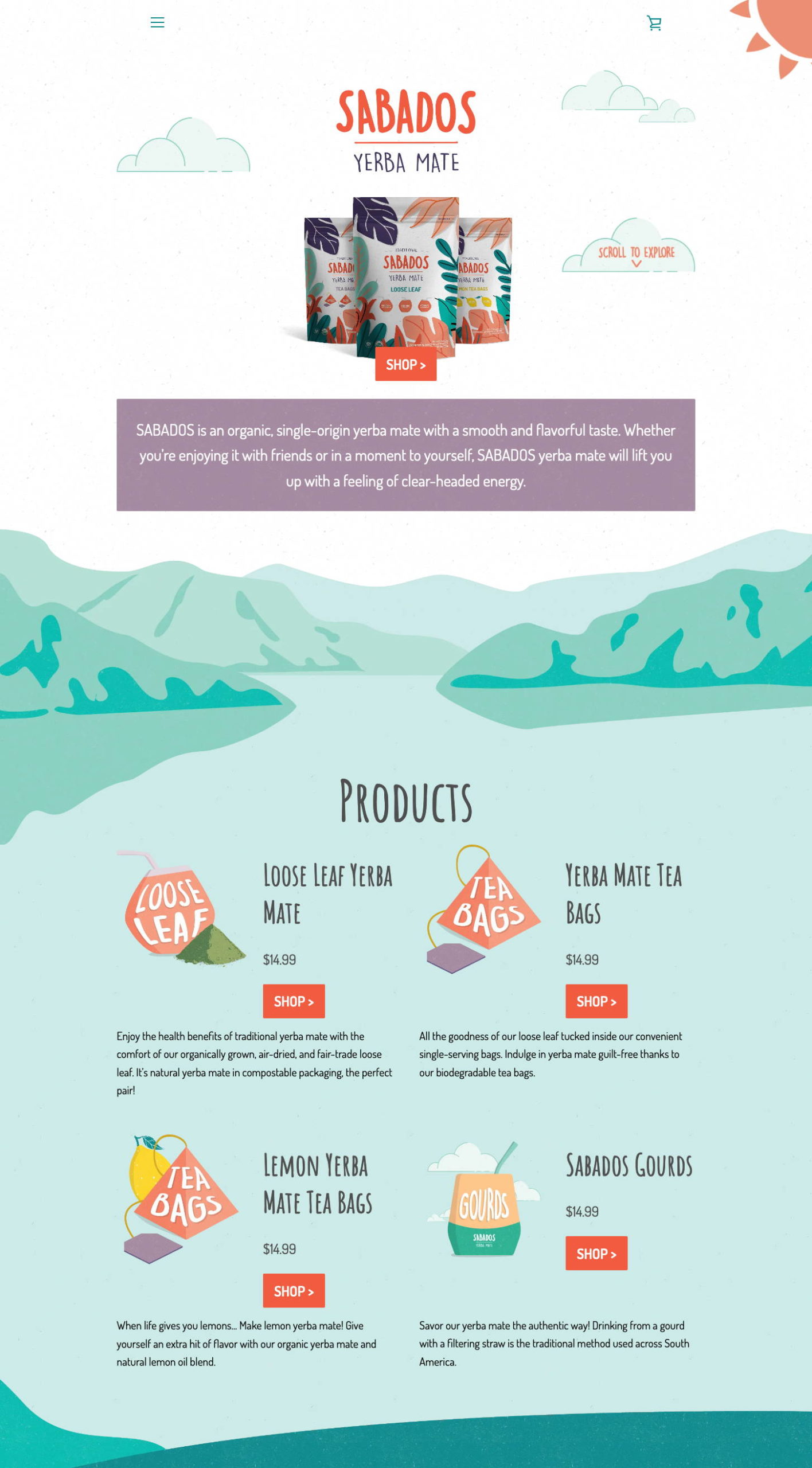
The first priority was to create a fun, interactive, and overall informative website – the ‘hub’ of the brand. Right from the homepage, you could see what SABADOS is about, and more importantly, you could visualize the feeling you’d get when drinking yerba mate. Like the packaging, the web design was funky and cool, and reiterated their laidback and chill vibe. From the gentle moving sun in the top right corner to the puffy marshmallow clouds that move along the screen with you, immersing yourself in a place that gives you a cool, clear head had never been so easy!
“It was really great jumping on weekly calls with [Rootree]. It made us feel as if we were a priority, and it helped us understand the different aspects of the process. Everyone was on the call every week, so every part of the process was always addressed. It was a great learning opportunity for me, but it was also great for knowing the project was on-track.”
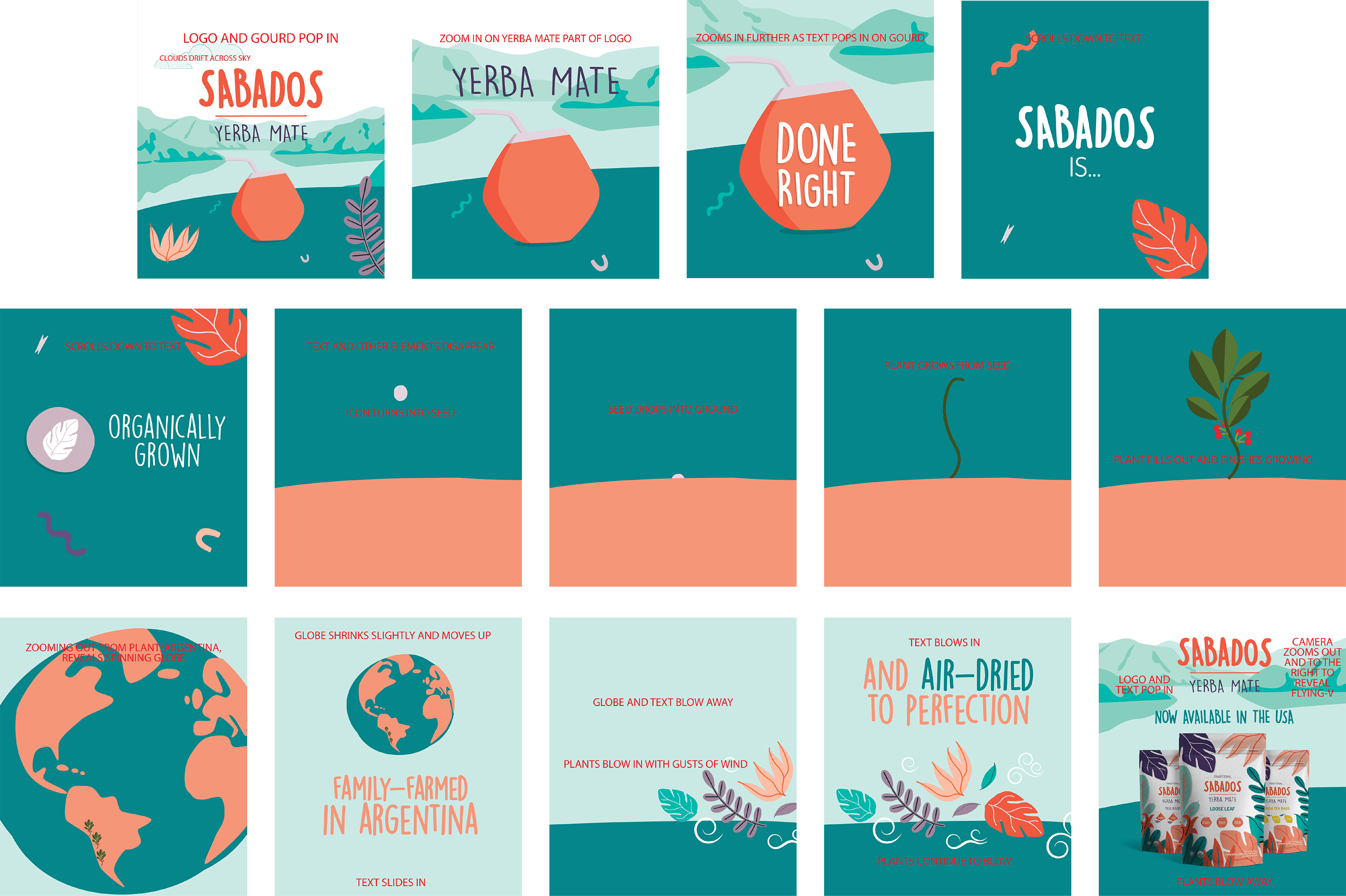
Before the team set out to create any animations, they put storyboards together for each video so Ray and John could easily visualize what each individual video would look like, and to minimize any revision time in the future!

Social Media Strategy