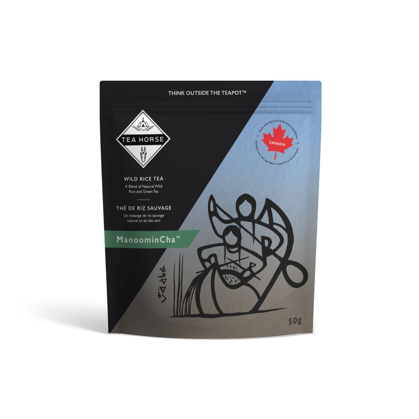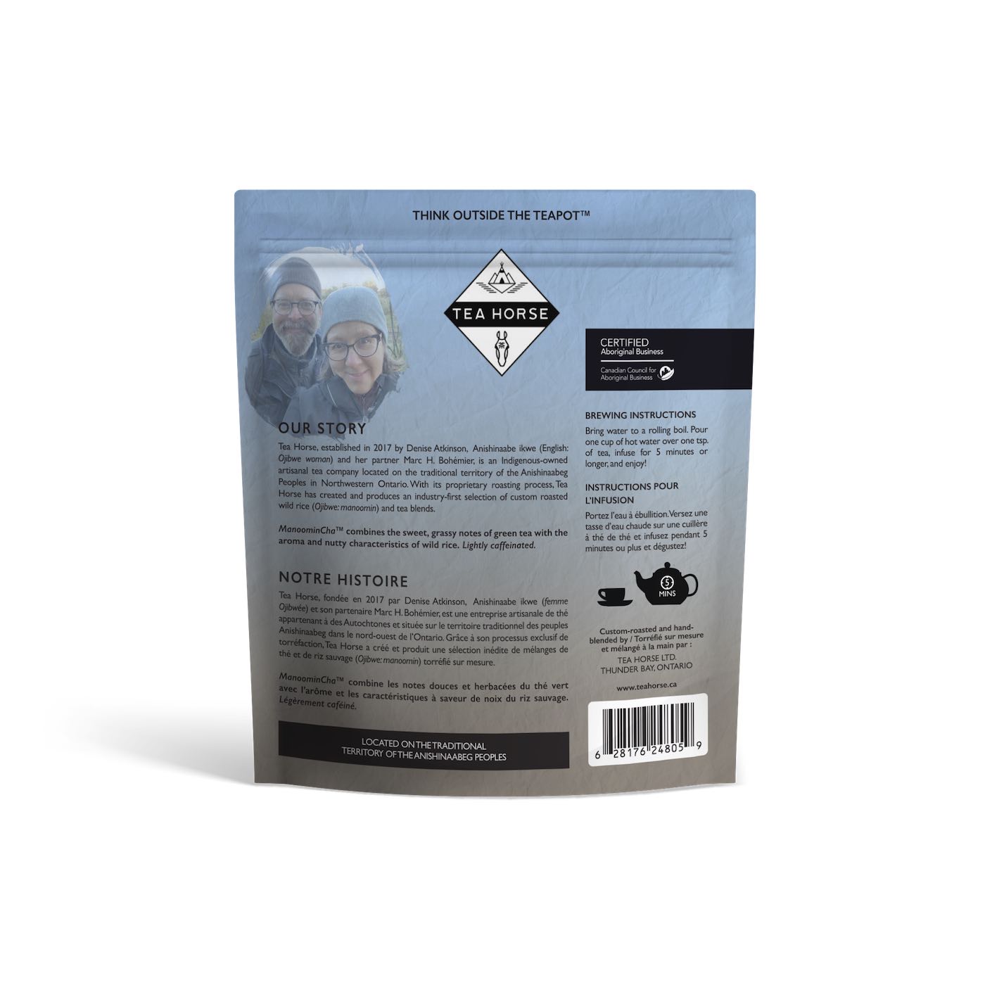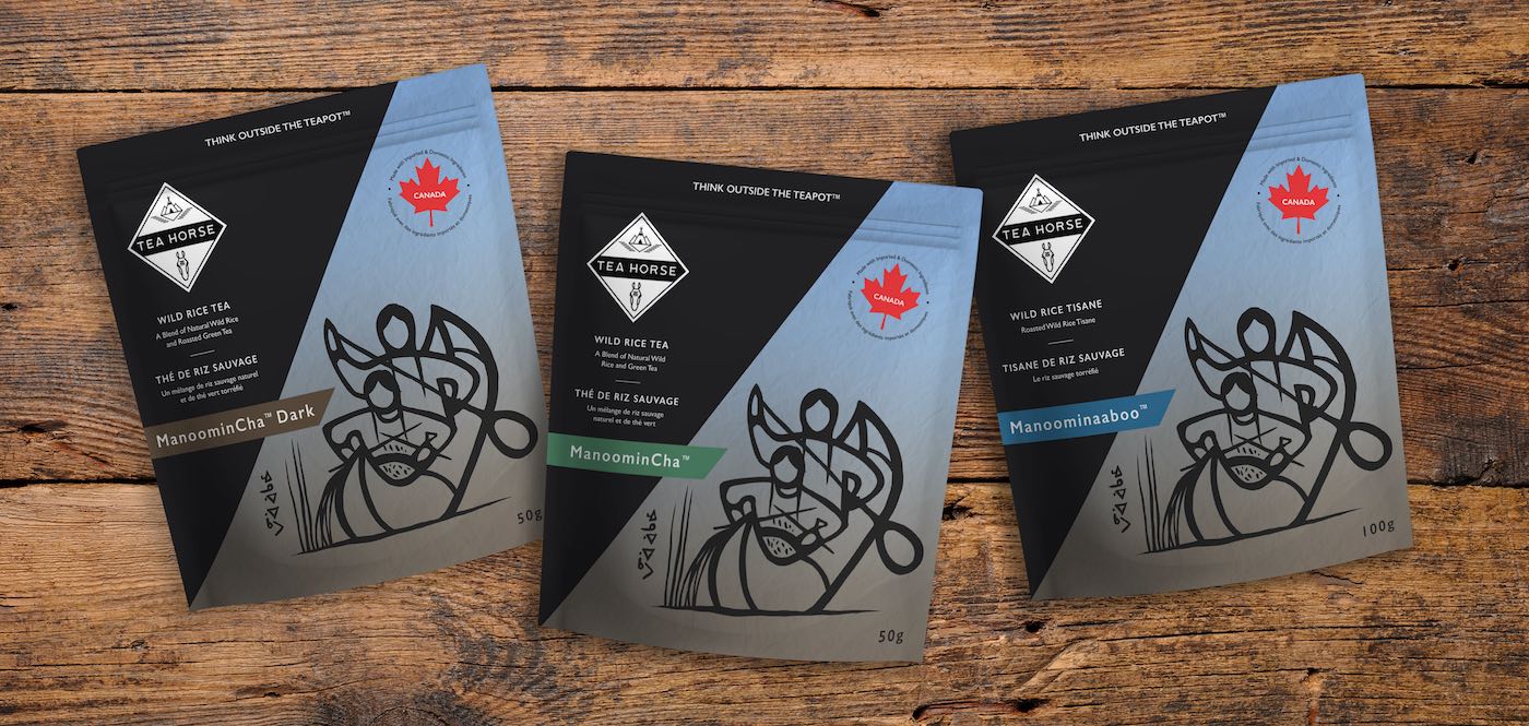

Kevin works out ofThe Creative in Thunder Bay creating eye-catching and unique paintings, one of which is featured in the final design. This artwork is accompanied by their logo within a fun triangular space and clear information about the tea inside. The design contains uniquely featured colour bars to differentiate their various products.

Introducing Manoomin – Wild Rice!
The story doesn’t end here, now that we have completed their core product line, it’s time to continue their rollouts with their new Wild Rice SKU.
Following the success of their wild rice tea, Teahorse was ready to expand into packaging their wild rice. The design on the rice packaging needed to be very different from their tea line, while remaining on-brand. Working with Teahorse, the Creative Services Team decided to go for a lighter design, featuring the Indigenous artwork in full colour. The front features a birch bark texture honouring the material that traditional canoes are crafted from. The dynamic diagonal across the packaging allows for a window to reveal the rich, dark rice. The result is packaging that reflects the Indigenous North American origins of this special rice.