Search

Design Trends Blog
With a new year comes new ideas and innovations in the world of packaging design. The consumer packaged goods industry is filled with gorgeous pouches, sachets, bottles, and containers, and they’re always evolving. This might be the year you decide to revamp your packaging or launch a new product — how can you make sure your custom printed packaging is up to par with the big players and fulfills your consumers’ preferences?
From 90s neons to hidden messages, here are 10 predictions from Rootree’s design team for the next big things in packaging design!

1. Playing into nostalgia
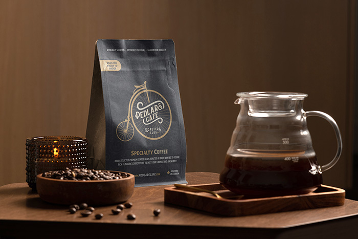
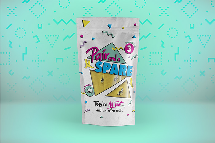
We are seeing more and more packaging plays into nostalgia with specific design elements. We’ve seen companies travel back in a time machine to the 60s or 70s by using retro logos that people can recognize and connect with on an emotional level. While modern minimal designs are great, they often lack their own unique element setting them apart from other trendy brands. They also don’t often invoke the same feeling of warmth or connection that nostalgic designs can. Using logos, motifs, fonts, and other elements inspired by the past is becoming increasingly popular, and we definitely don’t see this trend falling off anytime soon.
Nostalgia
90s Pouch

2. 90s-inspired neon tones and styles

On that nostalgic note, how about those vibrant neon tones that were so popular in the 90s? We’re seeing a lot of brands adopt neon colours in their packaging to catch the consumer’s eye (how often do you see a bright neon pink and blue pouch at the grocery store?). These funky colours and retro shapes are a great way to try something different and set your brand apart.

3. Bold and playful fonts

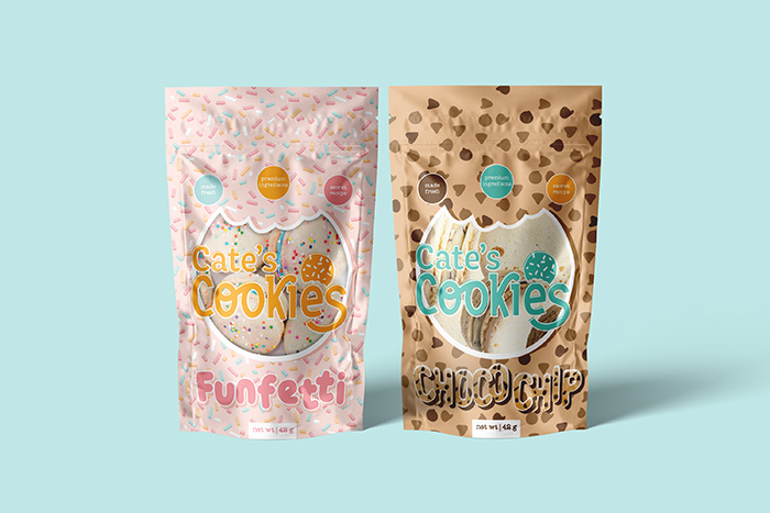
In terms of text in design, we’re seeing an increased use of unique fonts that stand out strong. Bold and playful fonts differ from typical packaging font choices, in a great way. Show off your brand’s personality and connect with the customer right off the bat — your packaging tells a story, and you want it to be consistent with your brand identity!
Bold Fonts Cookie Brand
Calligraphy
Image by Dribbble via dribbble.com

4. Calligraphy

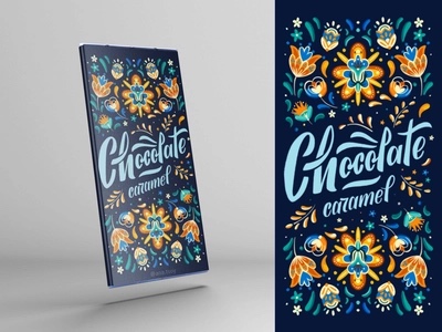
Another font choice that we love is calligraphy. It’s artistic and visually pleasing, especially in combination with other design elements. Like playful fonts, calligraphy shows off your brand’s personality and captures the customer’s attention. There’s nothing better than a package that also serves as a piece of art.

5. Hidden messages

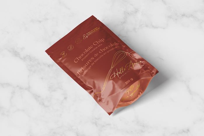
For example, this HelloAmino pouch shows off its metallic detail on the bottom of the stand-up pouch, the gusset. When your customer catches a peak at this, they’re bound to admire the extra feature. With hidden messages your pouches look good from any angle.
Hello Amino Pouch Choc Chip
Saw Dog Pouches

6. Showcasing environmental & social responsibility

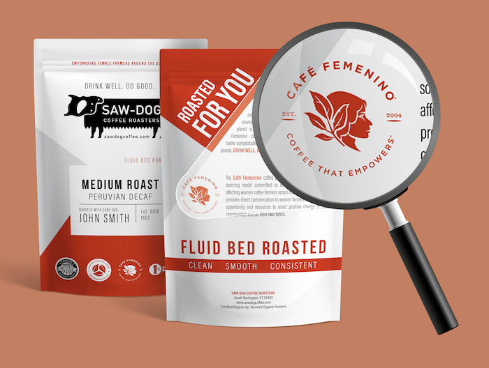
Is your business committed to environmental and social responsibility? Share this with customers by including information for them within your packaging design! In recent years, we’ve definitely seen a shift toward sustainability within businesses’ goals and customers’ demands. In 2022, we’ll likely see more brands showcasing their environmental and social responsibility prominently on their packaging, whether that be through certifications, text blurbs, or images.

7. Bold colours & simple shapes

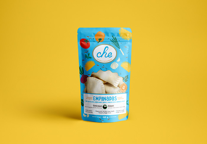
Fun, quirky patterns and colours never get old. These days, more brands are showing off their artsy side by designing packaging with bold colours and simple shapes. These shapes could include anything from geometric forms to simplified illustrations. Take this packaging by Hill St. Bases for various baking mixes; it uses bright, unconventional colours in combination with simple shapes or bakery item drawings. The result is eye-catching and unique, certainly standing out amongst other typical baking mixes. It’s a simple formula, but it sure does work.
Bold Shapes Example
Simplified Logos
Image by Bluetext via bluetext.com

8. Simplified logos

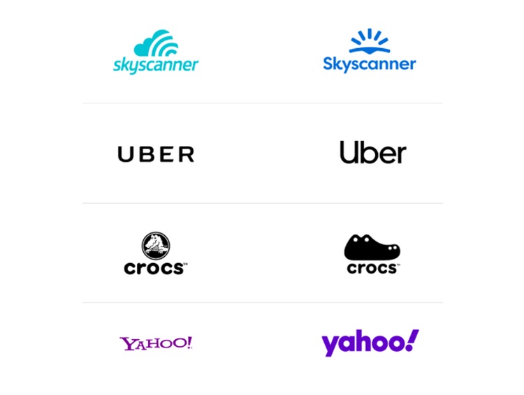
Another huge trend we’ve been seeing recently is simplifying standard logos. Many businesses — including banks, car manufacturers, and food brands — have rebranded over the past few years, turning towards minimalism and simplicity. This could mean removing details from their logos, simplifying colour schemes, or adopting a new logo altogether. Simplified logos add not only a fresh, modern feel, but also add flexibility; these days, it’s important that logos are easily transferable to apps and social media. A simplified form can be more legible and adaptable, while staying true to your brand by maintaining those recognizable key elements.

9. Gradients
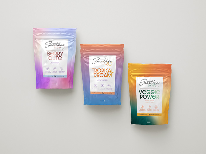
Colour gradients have been especially popular recently for drink brands and beauty products. They make for visually stunning packaging, especially combined with soft, bright colours and minimalist text designs. A gradient background or accent to your packaging design adds an aura of calmness and beauty — consumers will definitely take note.
Gradients Pouches
Custom Illustrations

10. Custom illustration

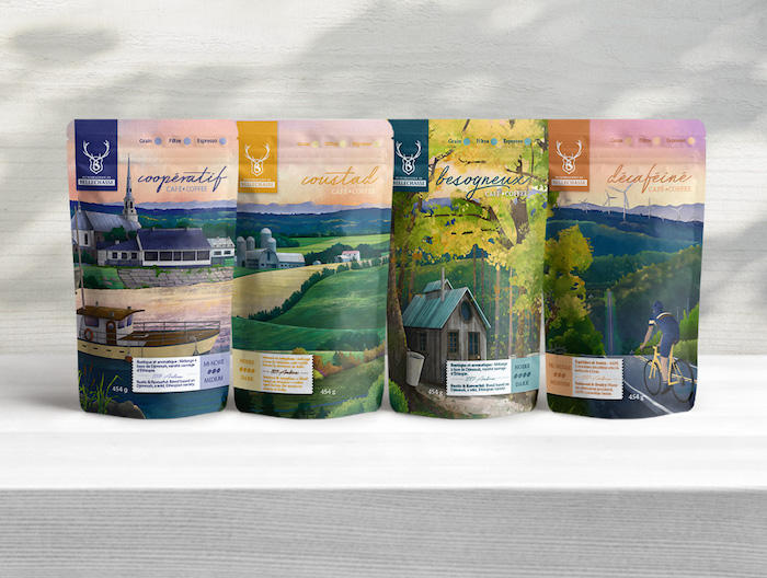
What better way to personalize your packaging design than with a custom illustration? Illustrations can be used to showcase a brand identity or involve the customer in a story. Rather than using generic images and symbols, custom illustrations help your product stand out. When the package is empty, the customer might even want to hold onto it as a piece of art. Take this line of pouches for the Microbrasserie de Bellechasse. This packaging showcases the region of Bellechasse, Quebec through beautiful custom illustrations. Customers might even be inclined to make a purchase not just for the coffee inside, but as a souvenir to remember the store and the town.
The world of packaging design is always evolving, and our Creative Services team loves to experiment with new trends. From fonts, to logos, and physical pouch choices, we’re bound to see some remarkable new trends in 2022. It’s the perfect time to update your packaging, revamp your designs, or start from scratch with the pouch you’ve always dreamed of. At Rootree, we’re here to help, so don’t be afraid to reach out — we’d love to join you on your packaging journey. Got any other ideas for possible packaging design trends this year? Let us know! We’re always looking to stay in the loop and take new risks.