Search

Storm

Storm Organic Plant Food

Originally based in Tignish, PEI, Storm Organic Plant Nutrition is a small, family-run business with a mission to provide gardeners with a little-known secret to help them keep their gardens healthy. Coastal farmers who have access to this ingredient have been using it for ages, but Storm wanted to make it accessible for everyone. The main component is none other than Atlantic seaweed that was foraged off the coast to help gardens thrive with rich micro-nutrients and bio-stimulants that help soil maintain productivity. We love that Storm loves plants as much as we do and found an environmentally friendly way of giving plants a boost.

Storm Pouch Bottom
What better way to make a splash in the e-commerce and gardening world than with new branding?! Storm wanted their brand to showcase the product’s coastal origins and attract a younger generation of passionate gardeners. It was important to them that their logo was elegant but light, fun, and reflects that the product is made of seaweed.
After showing them an array of options that matched up with their description, they selected a modern, vibrant visual paired with a vintage serif font. The cresting wave that curves in a circular motion represents the renewable power of nature and sustainability that Storm stands for. In terms of the typography, the vintage font gives the logo a sense of tradition –coastal provinces have been harvesting seaweed washed up on the shore by storms for centuries.
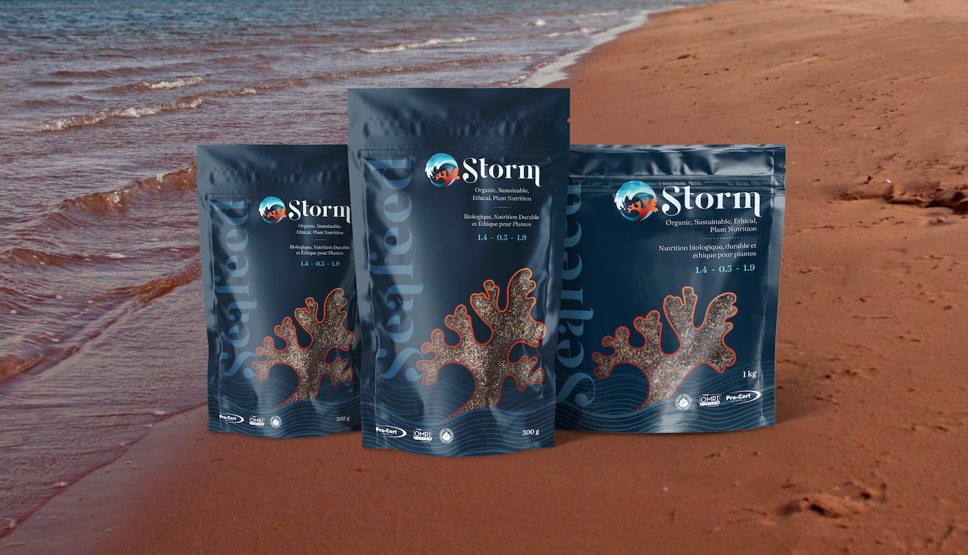
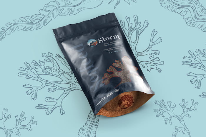
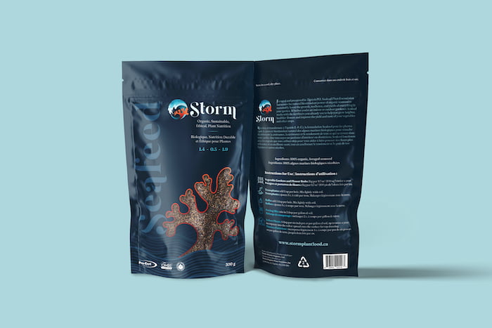
The next stop on Storm’s journey was having us create a packaging design equally as elegant, fun, and modern as their ocean-themed logo. The packaging would need to be appealing to even the most discerning gardener while still being both informative and attractive. To make the pouch even more special, they also requested a window so that their unique product could be seen by prospective shoppers. In the end, our team produced a lot of great options with fun and interesting windows. Storm selected a version with a beautiful, deep blue design accented with simple, line art waves and a window in the shape of the Irish moss found in the logo. The contrasting deep blue with the pop of red-orange helps these pouches stand out from other plant food companies and creates a striking overall appearance on the shelf.
Storm Pouch Front and Back
With their business branded and their packaging ready to go, all Storm needed was sell sheets to help them approach wholesalers. These would need to be an information-based leave-behind for wholesalers to consult continuously as they order a new product. Rather than making something with just the essentials, Storm wanted to make a buoyant design that would rise above all the rest. We created a double-sided sell sheet that concisely and visually lays out all the information. As seen from the sheet’s render, the eye is drawn easily from top to bottom with a clear hierarchy of content. The page is divided up with beautiful imagery to make it easy to see key selling points. In the end, Storm found themselves with a striking and memorable sell sheet in English and French.
Our final step was creating a website that would be the perfect home base for their gorgeous pouches and online presence. With Storm’s branding ready to set sail, we went to work on designing their bilingual, e-commerce website. Like their branding and packaging, we wanted the web design to be fun and youthful. A video background on the homepage would give hints at the seaweed harvesting process and the “Science of Seafeed” page would guide the viewer through the process in a clean and organized manner.
We were so happy to help this wonderful eco-friendly company grow their branding, packaging, and website so that they could take the gardening world by storm.