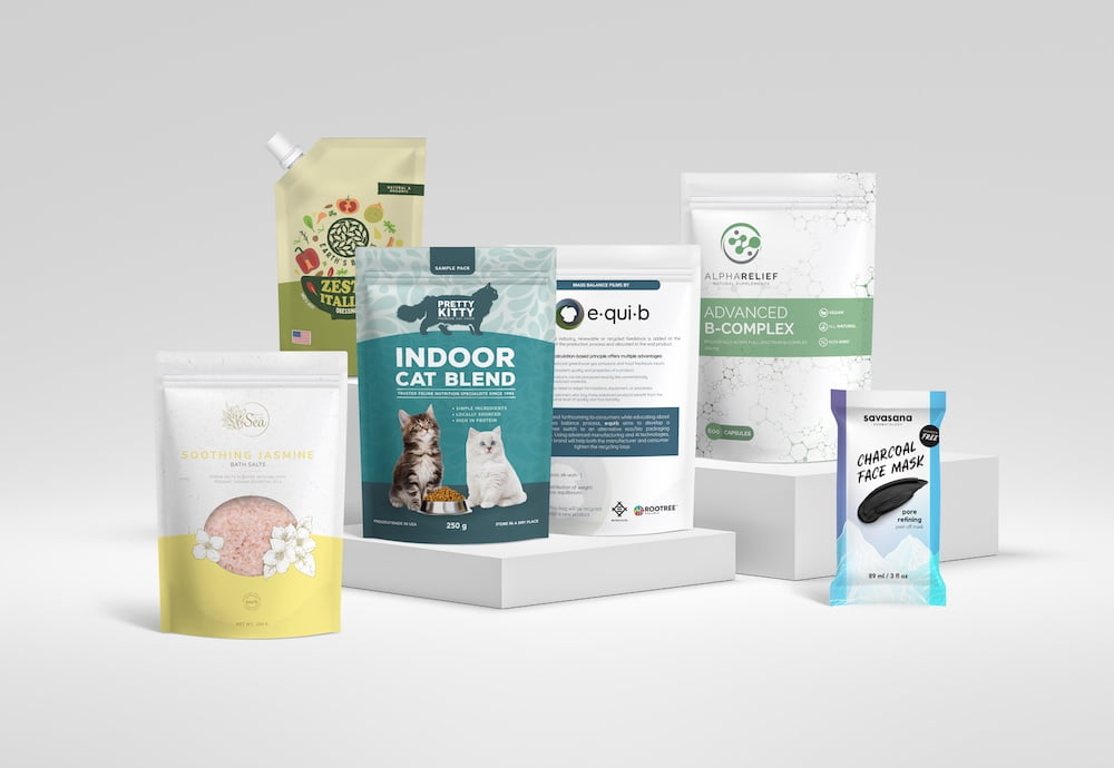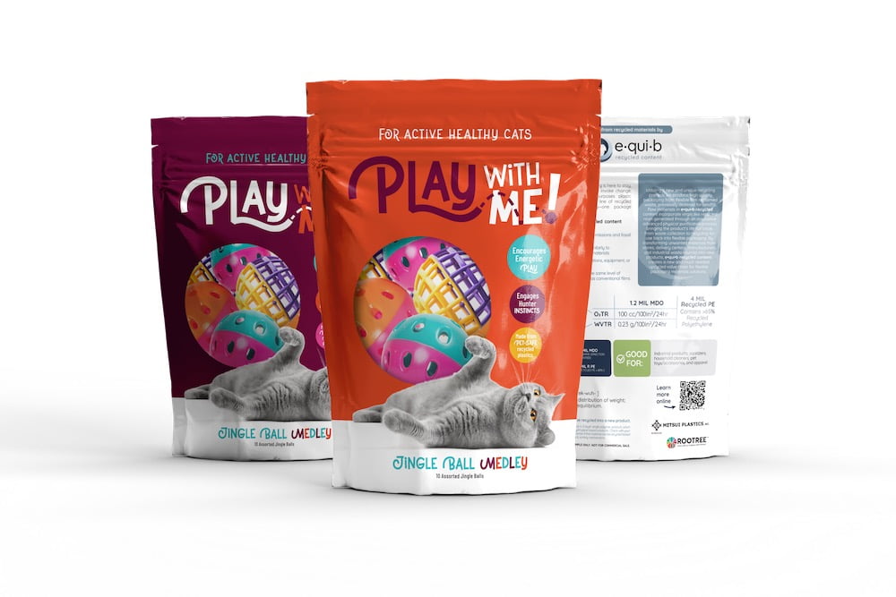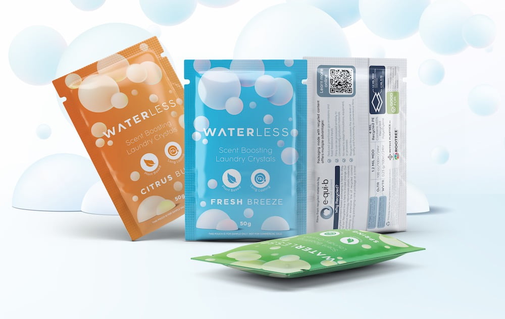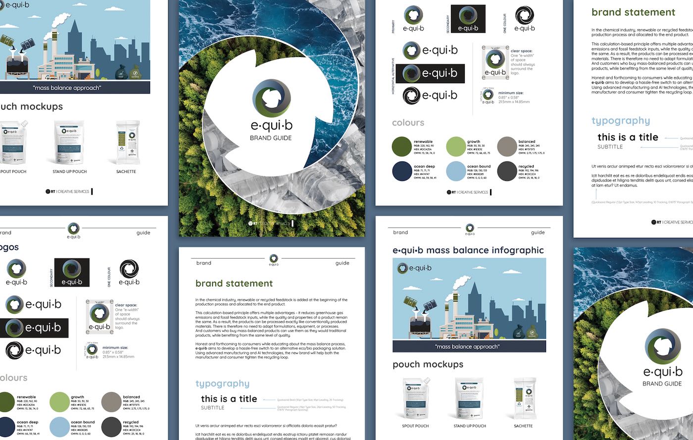

The team behind e·qui·b came back to us wanting to add an e·qui·b 2 with plans to eventually launch an e·qui·b 3 later. We knew we wanted to add e·qui·b 2 to the existing branding but needed to figure out how we’d approach this addition. Ultimately, we decided that creating a family of logos made the most sense. Without needing to alter the original e·qui·b logo, we adjusted the branding so that each colour would represent a material stream. Mass balance was now represented as green, recycled materials are shown as blue, and forthcoming paper is recognizable as grey. With this clever approach and a minor branding adjustment, the original logo now embodies all materials and new monochromatic logos were added to represent each individual stream.
The look is clean and maintains consistency throughout each visual. For each sub -brand, the darkest arrow in the new logo is the same colour and in the same position as it is in the original e·qui·b logo. Lighter, matching colour gradients were then used for the other two. A tagline outlining which material is represented was also added in the appropriate sub-brand colour to further explain which stream is which.
Mitsui Automotive
